Table Of Contents:
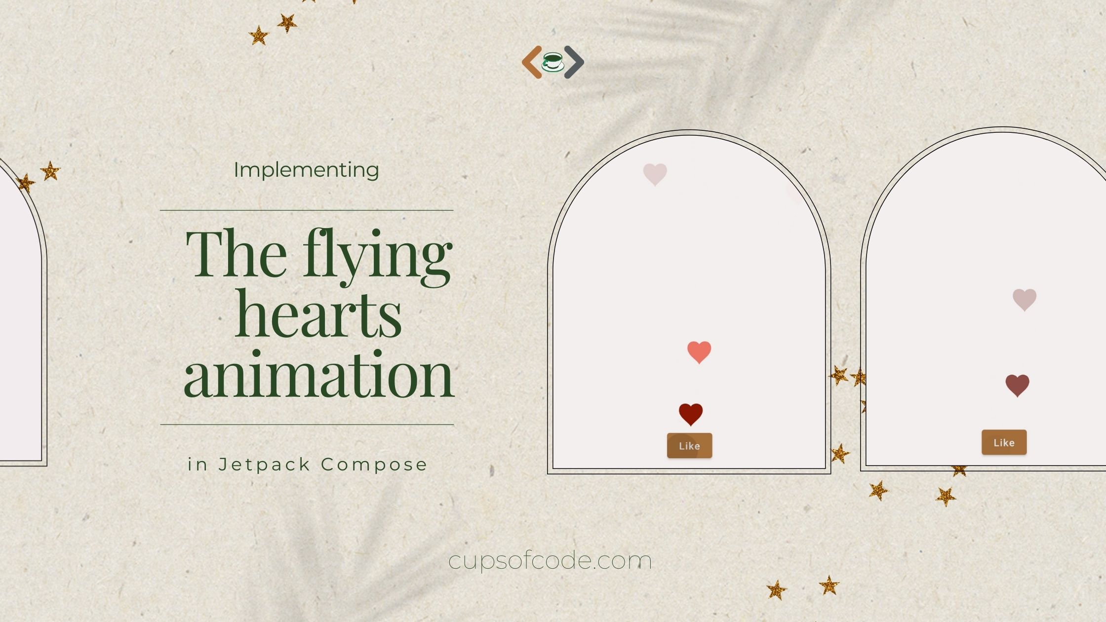
I find that the best way to learn anything is by replicating existing features. The flying hearts animation became quite popular when Instagram introduced a live-video feature. And I thought this could be a really good feature to practice animation in Jetpack Compose.
At first, it may seem like a complex animation, but if we look closer, for version 1 only two properties are used: visibility and the position of each heart. In this tutorial, I’ll walk you through the implementation details of it, using the versionImplementing the flying hearts animation (from Instagram live videos) in #JetpackCompose#AndroidDev pic.twitter.com/Wqi1PLuJJm
— Aida Issayeva 🌻 (@Aida_Isay) February 19, 2022
1.1.0-beta01 of Jetpack Compose.1. Drawing the heart shape
In Jetpack Compose, there are multiple ways to apply a custom shape to a component. In the previous article , I wrote about leveraging the Shape API. In this one, I’ll use Canvas API to have precise control over what’s drawn on the screen.
Note: Canvas API of Jetpack Compose still hits the view-based Canvas API under the hood. However, it provides a more developer-friendly interface and takes care of managing states, performance, etc.
The new Canvas API exposes DrawScope , a scoped drawing environment that provides sizing information and different transformations. The biggest benefit of using DrawScope in the new API is there is no longer a need for maintaining the underlying state of the Canvas . This means that creating and updating the objects happens in one place.
 1@Composable
 2fun Heart() {
 3    Canvas(modifier = Modifier
 4        .fillMaxSize(),
 5        onDraw = {
 6            val path = Path().apply {
 7                heartPath(Size(120f, 120f))
 8            }
 9
10            drawPath(
11                path = path,
12                color = Color.Red,
13            )
14        }
15    )
16}
The heart path extension is available here .
2. Introducing the state
For this animation, we have two states: Show and Hide .
1enum class HeartState {
2    Show,
3    Hide
4}
When the heart is shown, it will appear and move in the upward direction. When it’s in the hidden state, the heart disappears at the reached position.
The transition between states in the flying hearts is not fully user-controlled, the state change from Show to Hide happens automatically within a certain duration. To make that transition we’ll use LaunchedEffect to swap the states:
1    LaunchedEffect(key1 = state, block = {
2        state.value = when (state.value) {
3            HeartState.Show -> HeartState.Hide
4            HeartState.Hide -> HeartState.Show
5        }
6    })
3. Adding Visibility animation
Now with the state in place, we can start adding animations. The first property to animate is opacity, aka alpha in view-based and compose-based UI components. There are multiple ways to animate the appearance and disappearance of the element in Compose:
a) wrapping the element in high-level animation API AnimatedVisibility;
b) leveraging Modifier function alpha to set the visibility of the element;
c) using alpha parameter in drawPath() function to set the visibility of the Path.
I went with the AnimatedVisibility API.
When using AnimatedVisibility the entire content of the element will have the enter and exit animations. Under the hood, AnimatedVisibility creates a custom layout for the element and its content. Once the exit animation is completed, AnimatedVisibility removes the element and its content from the UI tree and then finally disposes.
1    AnimatedVisibility(
2        visible = state.value == HeartState.Show,
3        enter = fadeIn(animationSpec = tween(durationMillis = 250)),
4        exit = fadeOut(animationSpec = tween(durationMillis = 700)),
5    ) {
6        Text(text = "This is a Text1")
7        Text(text = "This is a Text2")
8    }
In the example above, both Texts will fade in at the same time and with the same easing.
In AnimatedVisibility only parameters visible and content are required. The parameters enter, exit, modifier, and label have default values. By default, the content appears by fading in and expanding, and it disappears by fading out and shrinking.
4. Adding Position animation
Now the next property to animate is the position of each heart. With each frame, the heart moves up.
Let’s refresh our knowledge of the canvas coordinates system: the top start corner of the screen has (0,0) coordinates, while the bottom end has (width, height) coordinates.
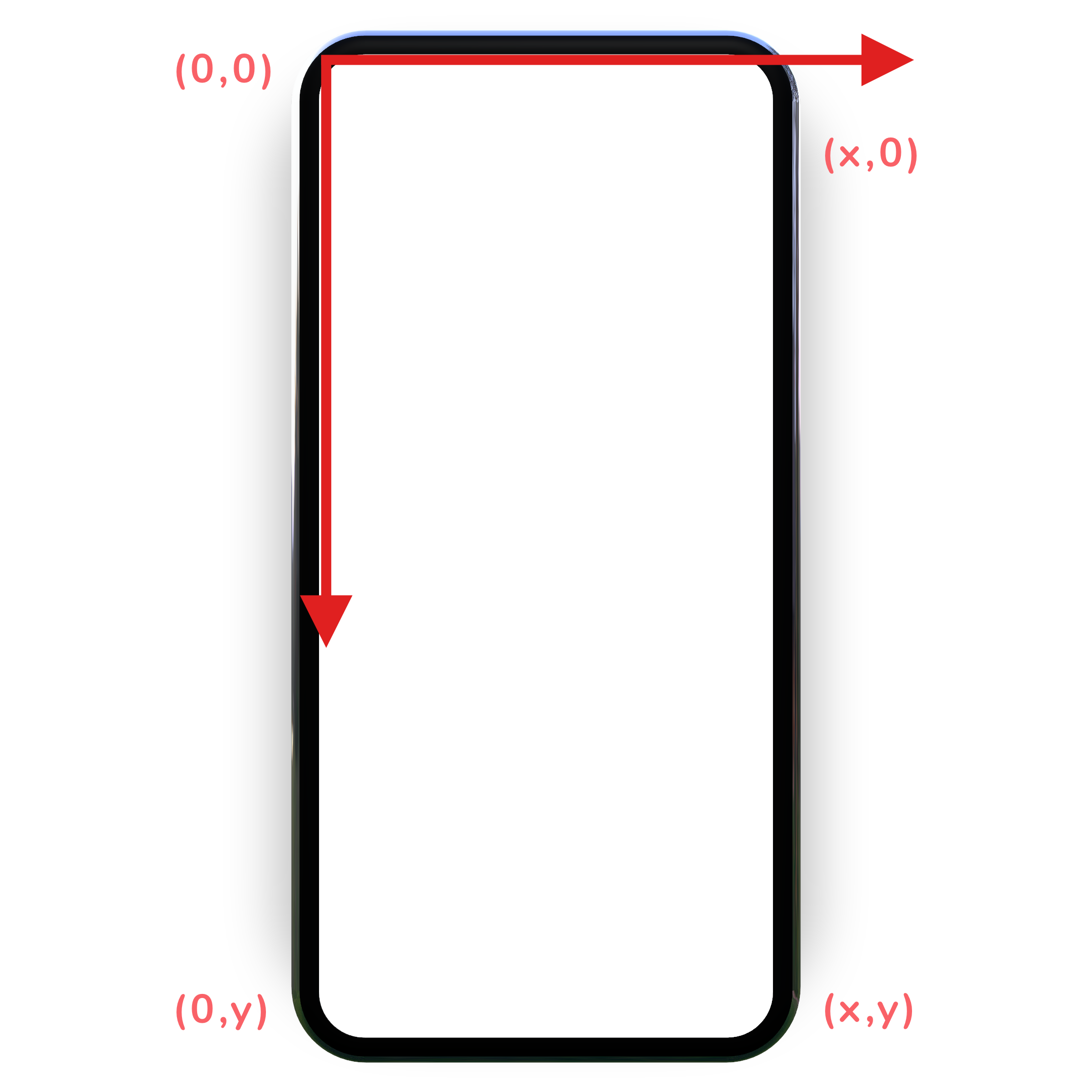 *The image is taken from @hi_man_shoe
’s article “Understanding Canvas API in Android”
.
*The image is taken from @hi_man_shoe
’s article “Understanding Canvas API in Android”
.
Now for the movement of the heart, we need two coordinates: start (x,y) and end (x1, y1). Because the heart goes up, the start coordinate will be in the bottom half of the screen, while the end coordinate in the top half.
Let’s assume, for the start coordinate in X-axis, the animation will start at width/2 , and in Y-axis it’ll start at height - (bottomMargin + buttonHeight).
For the end coordinate, let’s calculate random values, using Random generator class:
1val yRandom = Random.nextInt(0, height / 2)
2val xRandom = Random.nextInt(0, width))
yRandom has a minimum value of zero, the top point of the screen, and a maximum value of height / 2 , the vertical center of the screen.
xRandom has a minimum value of zero, the left point of the screen, and a maximum value of width , the right point of the screen.
As for animation, we can use low-level animation API animate*AsState function, specifically the animateDpAsState() :
1    val offsetYAnimation: Dp by animateDpAsState(
2        targetValue = when (state.value) {
3            HeartState.Show -> height.dp
4            else -> yRandom
5        },
6        animationSpec = tween(1000)
7    )
1    val offsetXAnimation: Dp by animateDpAsState(
2        targetValue = when (state.value) {
3            HeartState.Show -> (width / 2).dp
4            else -> xRandom.dp
5        },
6        animationSpec = tween(1000)
7    )
In animate*Float/Color/Dp/Size/Offset/Rect/Int/IntSize/IntOffset*AsState functions, only targetValue parameter is required, the rest have the default values.
animationSpec stores:
the data type to be animated;
the animation configuration, that will be used once the data has been converted to
AnimationVector.
In the example above, I used tween spec with default FastOutSlowInEasing.
It’s worth noting that
animate*AsState()is perfect for animating a single value. To animate multiple values it’s better to useupdateTransition()that will return the instance of Transition. However, in this example, using transition gave me janky and earthquake-shaky animation.
With the declared animation properties for the position, we can pass them to:
the
translate()function of thePath;the transformation function
translate()of theDrawScope;modifier function
offset()of the canvas.
I chose the latter one:
1    Canvas(
2        modifier = modifier
3            .offset(y = offsetYAnimation, x = offsetXAnimation)
4    )
5. Making it multiple
To make hearts appear on each click, we introduce the counter:
1 val heartCount = remember { mutableStateOf(0) }
On each button click, we’ll increase the counter:
1    Button(
2        onClick = {
3            heartCount.value++
4        }
5    )
Then wrap the canvas into Kotlin’s repeat inline function:
1    repeat(heartCount.value) {
2        Heart()
3    }
6. Additional animations
The animation function animate*Float/Color/Dp/Size/Offset/Rect/Int/IntSize/IntOffset*AsState provides us out-of-the-box support for the extensive list of data types. We can introduce additional animation values and pass them to:
DrawScope’s transformation functions liketranslatealong the X and Y axes,scalein both vertical and horizontal directions,rotateto the current transform, etc.DrawScope’s regular functions likedrawPath(),drawLine(),drawArc(),drawPoints(), etc where we can leveragecolor,alpha,sweepAngleand many other parameters.Modifier’s functions likebackground(),size(),border(), etc.
7. Clean up
After making the animations work, it’s time to modify the code and introduce parameters to the Heart() composable function.
The first parameter is the
Modifierto the Canvas component.The second one is the horizontal padding for the left and right sides of the X-axis animation to narrow the horizontal axis for the shape swaying.
The third one is the bottom margin of the screen to determine the beginning of Y-axis animation.
Additionally, we can introduce the duration of the animations and other parameters.
Full Code can be found here .
8. What’s next?
After making the animation work, my view-based brain couldn’t stop but wonder about the performance of adding and removing the layout for every single heart. So I decided to optimize the code, and draw as many paths as the button clicked using the repeat function or simple for-loop inside onDraw() function of Canvas, but after days of trying to make it work, I figured it was time to take a nice break and write this article.
If you know the solution, please share it with me in the comments or on Twitter. Thank you so much!