Table Of Contents:
Oftentimes, we get asked to create different custom views and shapes in Android Development. In the old view-based system, we heavily relied on Canvas to create a shape. Luckily, Jetpack Compose introduces new out-of-the-box ways to easily create and modify shapes on the fly.
This post will walk you through the available standard shapes in Compose Foundation and how you can leverage them for your needs or create custom ones.
What is Shape?
In Jetpack compose Shape
is an interface to define the form, contours, or outline of an object.
Two classes implement the Shape interface:
CornerBasedShapecreates a rectangle defined by fourCornerSizes.CornerSizecan accept dp, px, and percent values.CornerBasedShapeis a parent class to four shapes:RoundedCornerShapeandAbsoluteRoundedCornerShapeare used to define a rectangle with rounded corners.RoundedCornerShapeis layout-direction aware(LayoutDirection.Rtl) and automatically mirrors the corner sizes.
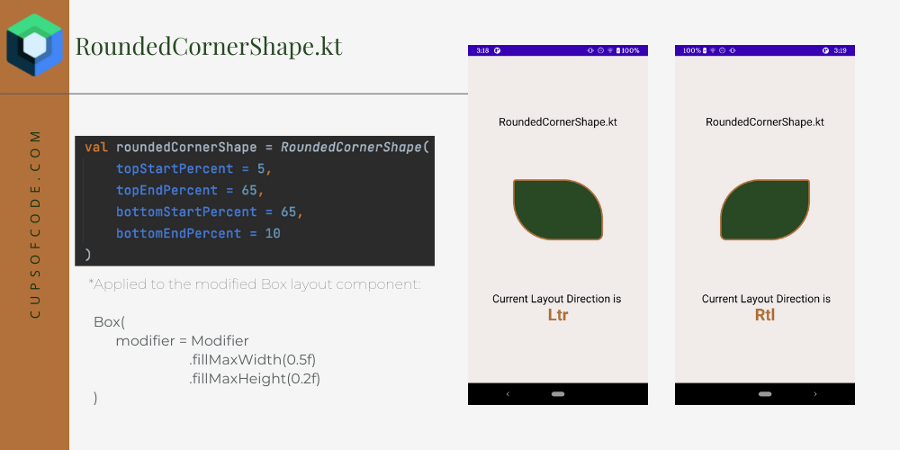 In the example above, the same parameters for
 RoundedCornerShapereturned a different shape based on the system’s layout direction.If you’d like to disregard it - use
AbsoluteRoundedCornerShape.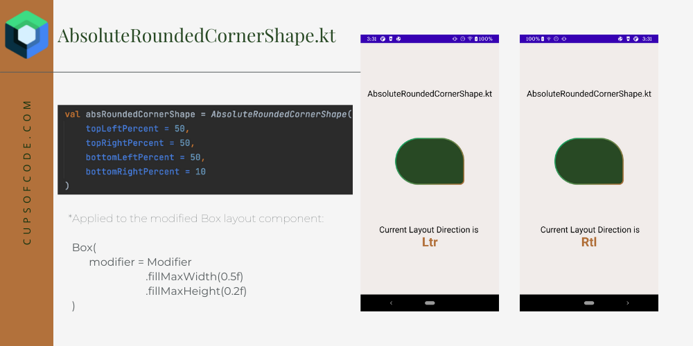
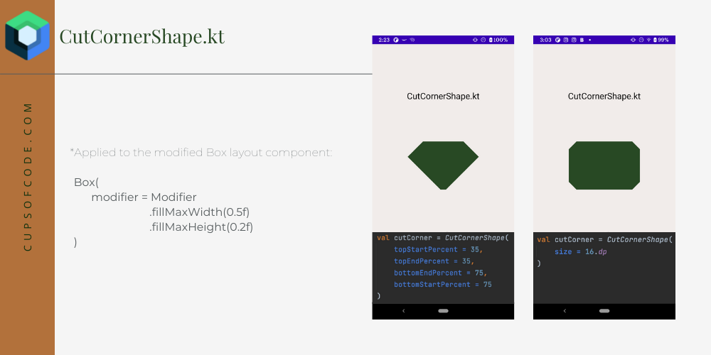
CutCornerShapeandAbsoluteCutCornerShapeboth define a rectangle with cut corners. Similar toRoundedCornerShape,CutCornerShapeis layout-direction aware and automatically mirrors the corner sizes. UseAbsoluteCutCornerShapeif layout direction needs to be disregarded.
GenericShapecreates a custom shape by applying the provided builder on aPath. More details are below.
The shape component also comes with two top-level properties, that don’t require any parameters:
RectangleShapeto apply a rectangle form;CircleShapeto apply a circle form.
1val circleShape = CircleShape
2val rectangleShape = RectangleShape
How to apply Shape?
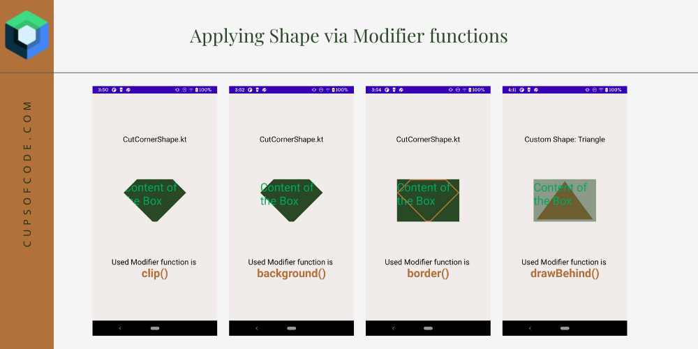
The shape can be applied to most Compose Elements and Layouts via Modifier. Several Modifier functions accept shape:
clip(shape)is an extension function, that will clip content to a selected shape. Under the hood, it hitsgraphicsLayer()function.graphicsLayer()is a function, that applies different effects to content such as rotation, scaling, clipping, and shadow.background(color, shape)is a function, that will apply the selected shape to the background and won’t affect the content.border(width, color, shape)is a function, that will apply the selected shape to the border.drawBehind()is a function that will draw the selected path behind the content. This function does not exactly acceptShapeclass, however, it provides a stateless APIDrawScopeto draw shapes and paths without requiring developers to maintainCanvasstate. You can pass thePathof a shape todrawPath()function inside.
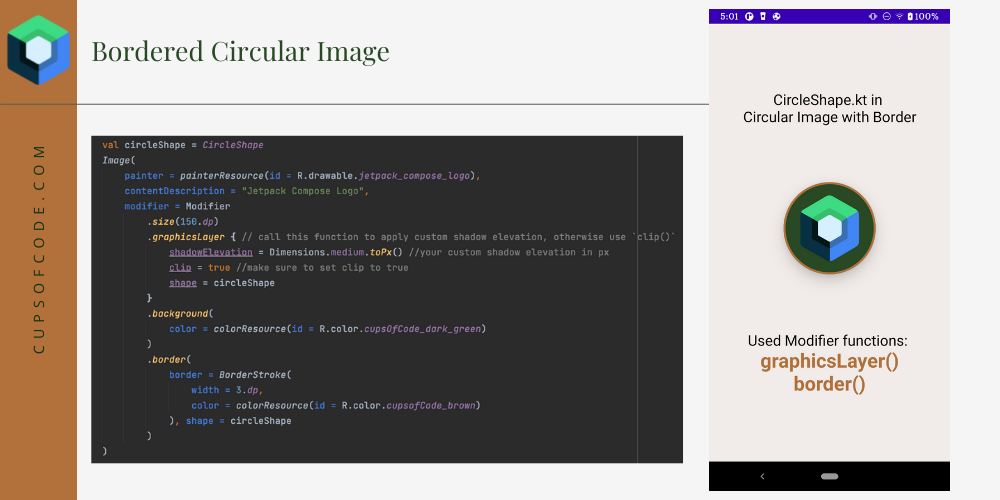
You can also combine any of the above functions simultaneously to get the most desired outcome. For example, to re-create a CircularImageView of the old view-based system in Jetpack Compose, you can leverage graphicsLayer and border functions:
 1val circleShape = CircleShape
 2    Image(
 3        painter = painterResource(id = R.drawable.jetpack_compose_logo),
 4        contentDescription = "Jetpack Compose Logo",
 5        modifier = Modifier
 6            .size(150.dp)
 7            .graphicsLayer { // call this function to apply custom shadow elevation, otherwise use `clip()`
 8                shadowElevation = Dimensions.medium.toPx() //your custom shadow elevation in px
 9                clip = true //make sure to set clip to true
10                shape = circleShape
11            }
12            .background(
13                color = colorResource(id = R.color.cupsOfCode_dark_green)
14            )
15            .border(
16                border = BorderStroke(
17                    width = 3.dp,
18                    color = colorResource(id = R.color.cupsofCode_brown)
19                ), shape = circleShape
20            )
21
22    )
The result is:
Create a custom shape
To create a custom shape, you can:
- a) create a custom class by implementing the
Shapeinterface and overriding itscreateOutlinefunction
or
- b) use
GenericShapeand pass a builder lambda to it. Under the hood,GenericShapeoverrides thecreateOutlinefunction ofShape.
For example, to create a heart, I’ve converted this logic
from StackOverFlow into an extension function heartPath() of Path (ext function is here
). Then you can use the first option and create a custom class Heart :
 1class Heart: Shape {
 2    override fun createOutline(
 3        size: Size,
 4        layoutDirection: LayoutDirection,
 5        density: Density
 6    ): Outline {
 7        val path = Path().apply {
 8            heartPath(size = size)
 9            close()
10        }
11        return Outline.Generic(path)
12    }
13}
Or use the second option with GenericShape :
1@Composable
2fun heart(): GenericShape {
3   return GenericShape { size, _ ->
4        heartPath(size = size)
5    }
6}
Both options will return a heart shape:
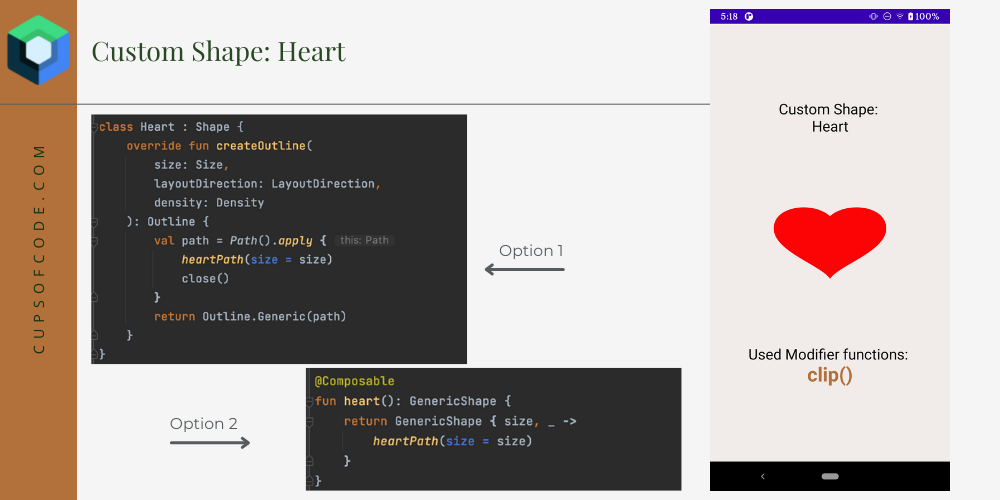
Note: when using
GenericShapeyou don’t need to callclose()function of thePath, because it’s already taken care of.
Final Thoughts
Shape API in Jetpack Compose provides quick solutions for complex UI elements. Unlike the old view-based system, Shape API doesn’t require additional vector XML files or deep-dive access to Canvas and the customization of most components can be done directly on them via available Modifier functions. So, give it a try and spend some time playing with it.
Thanks for reading! Let me know in the comments if you have any questions.